

Buttons rework
I’ve been rethinking the button system for a while. The issues weren’t new. Once I’m getting deeply into real projects, the problems appear more visible. Especially at my own marketplace project and the Commerly website. I even caught myself avoiding the “big” button component on commerly.eu and started building smaller variations by hand, just to keep things manageable.
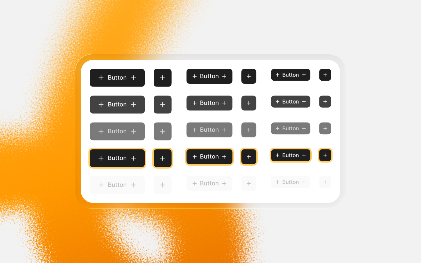
The current setup looks neatly: one large component that holds styles, hierarchy, and variants in one place. And it’s good while the system stays simple. But the moment you need something slightly outside that logic - an unusual surface, a small visual tweak, a single use variation for a specific flow - the structure itself starts pushing you back. Small changes stop being small, because everything is connected.
So I’m replacing it.
Instead of one combined component, buttons will be split into smaller, focused components. They’ll be grouped inside the file, mostly for organization. In practice, you’ll just pick what you need and adjust it without affecting unrelated styles. Changing colors, adding variants, tweaking outlines or radius should feel like a small task, and not like you rebuilding a mega component.
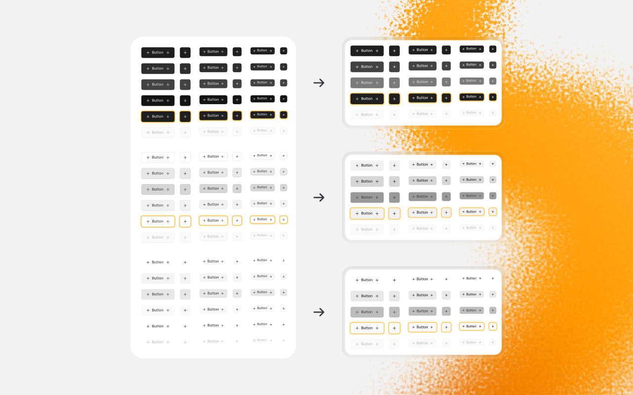
This update replaces the current button component, so if you already using it in your projects you have to swap them. I’m not keeping both systems side by side - mixing them would be more confusing than helpful.
I’ll also include a basic practical set (Brand, Black, White, Gray, Red, Green). It’s not “the recommended set” - just a flexible starting point that should cover most of the cases.
I’m also reworking the current “Overview” into structural guidelines: How those buttons are built, and what they’re meant to handle. If I don’t match my own deadlines, I’ll include this into the next update.
And if you ever worked with complicated product flows with tricky button components, I would really love to hear about your experience. You can share it through the “Feedback & Suggestion” button below.

Suggest an improvement

29 Mar 2026
Support the project
Help Commerly
keep growing


Support
ongoing work


Community in
Discord
Commerly was built independently and free for everyone. Your support helps it stay alive, while the foundation is being built.
Starts from €3/month
Become a Patron
You can cancel or change your subscription anytime.
Buttons rework
I’ve been rethinking the button system for a while. The issues weren’t new. Once I’m getting deeply into real projects, the problems appear more visible. Especially at my own marketplace project and the Commerly website. I even caught myself avoiding the “big” button component on commerly.eu and started building smaller variations by hand, just to keep things manageable.
The current setup looks neatly: one large component that holds styles, hierarchy, and variants in one place. And it’s good while the system stays simple. But the moment you need something slightly outside that logic - an unusual surface, a small visual tweak, a single use variation for a specific flow - the structure itself starts pushing you back. Small changes stop being small, because everything is connected.
So I’m replacing it.
Instead of one combined component, buttons will be split into smaller, focused components. They’ll be grouped inside the file, mostly for organization. In practice, you’ll just pick what you need and adjust it without affecting unrelated styles. Changing colors, adding variants, tweaking outlines or radius should feel like a small task, and not like you rebuilding a mega component.
This update replaces the current button component, so if you already using it in your projects you have to swap them. I’m not keeping both systems side by side - mixing them would be more confusing than helpful.
I’ll also include a basic practical set (Brand, Black, White, Gray, Red, Green). It’s not “the recommended set” - just a flexible starting point that should cover most of the cases.
I’m also reworking the current “Overview” into structural guidelines: How those buttons are built, and what they’re meant to handle. If I don’t match my own deadlines, I’ll include this into the next update.
And if you ever worked with complicated product flows with tricky button components, I would really love to hear about your experience. You can share it through the “Feedback & Suggestion” button below.
Feedback & Suggestions

29 Mar 2026
Support the project
Help Commerly
keep growing

Support
ongoing work

Community in
Discord
Commerly was built independently and free for everyone. Your support helps it stay alive, while the foundation is being built.
Starts from €3/month
Become a Patron
You can cancel or change your subscription anytime.